MarkLogic 9 Product DocumentationOps Director Guide — Chapter 4
MONITOR View
The Monitor view is an aggregate view that shows the summary of the state of resources in your enterprise.
This chapter covers the following topics:
Monitoring Dashboards
The default Monitor view displays the following dashboards, graphs, and panels:
- Key Performance Indicators
- Cluster Problem Distribution
- Top Problematic Hosts
- Busiest Servers
- Slowest Servers
- Alerts Panel
- Filtering by Resource
Key Performance Indicators
The key performance indicators panel is a set of active tabs for each resource type: clusters, hosts, databases, and application servers.
Selecting a resource type tab leads to a heat map view for that resource type. These tabs provide at-a-glance statistics, including overall system health and resource health for clusters, hosts, databases, and application servers.
Overall system health is indicated with a color-coded vertical bar at the top left side of the Monitor view, where red indicates a Critical condition, yellow indicates At Risk, and green indicates Healthy.
The overall health of the resources is calculated from a score generated for each alert type (only critical, at-risk, and unknown alerts are considered). The alert type that scores highest represents overall health of the system. The color of the vertical bar is the same as the alert type with highest score. Since there are no alerts for healthy, its score is calculated by getting a count of all healthy resources.
When only a subset of alerts are displayed, the overall health is calculated from the visible alerts. If there are no alerts, then the overall health is represented by green.
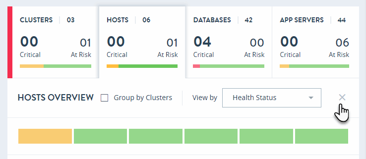
The overall health for the individual resources (clusters, hosts, databases, and application servers) is indicated by a combination of graphical and textual elements. For each resource type, the number of resources is presented; a horizontal bar depicts the distribution of health status as Critical (red), At Risk (yellow), Offline (light gray), Maintenance (dark gray), and Healthy (green); and the number of resources that are Critical and At Risk for a selected resource group.
Cluster Problem Distribution
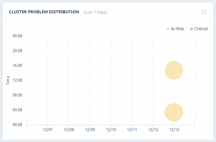
The Cluster Problem Distribution graph provides a visualization of the time and date of cluster events over the last seven days. Hover over the event icon to view details.
Top Problematic Hosts
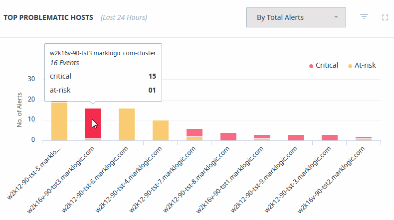
The Top Problematic Hosts graph provides a visualization of the hosts in your enterprise that have experienced the greatest number of events over the last 24 hours. Hover over the host bar to view details.
The Top Problematic Hosts graph can be sorted by a count of Total Alerts, or weighted based on the severity of the messages.
Busiest Servers
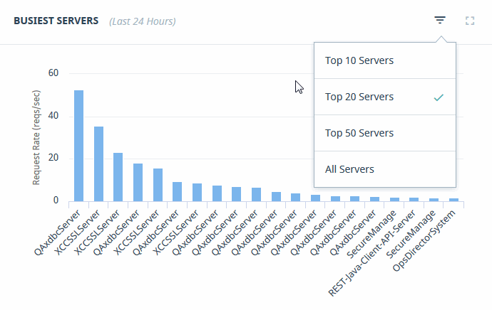
The Busiest Servers graph provides a visualization of the App Servers in your enterprise that have experienced the greatest request rate activity over the last 24 hours. Hover over the App Server bar to view details.
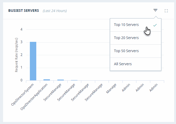
Some graphs enable adjusting the number of resources displayed by selecting the triangular icon in the upper right corner. For example, instead of monitoring all of the busiest servers, you can select the top 10, 20, or 50 servers.
Slowest Servers
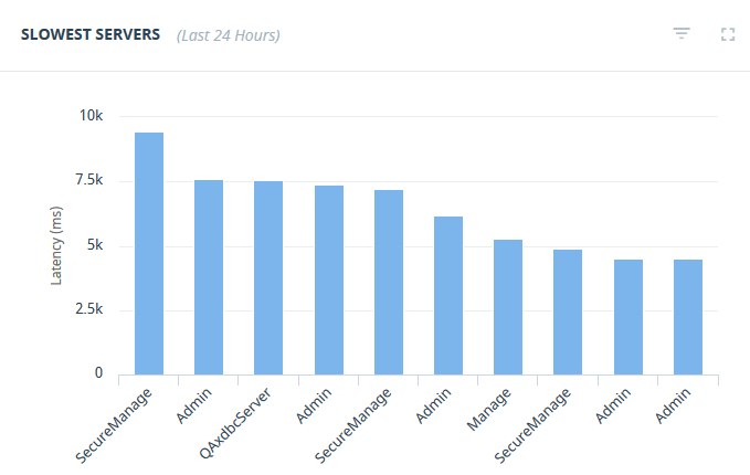
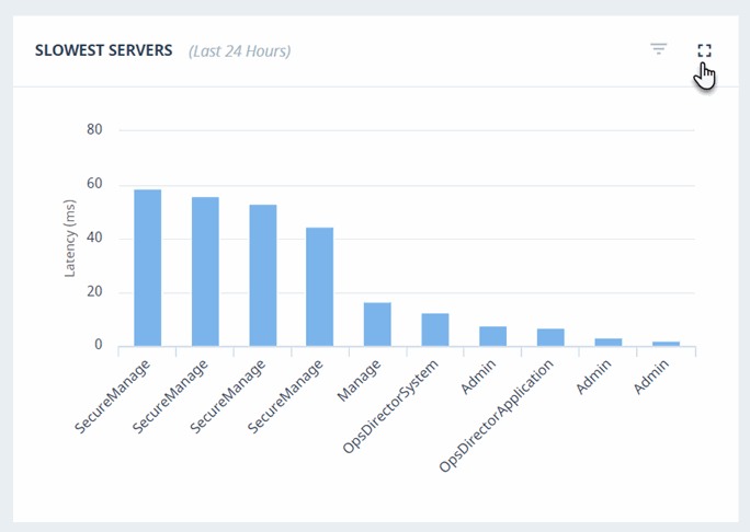
The Slowest Servers graph displays the App Servers in your enterprise that have the greatest latency the most activity over the last 24 hours. Hover over the App Server bar to view details.
All graphs can be switched to a full-size window by clicking the maximize icon. You may click on the minimize icon or click anywhere on the screen to get back to the previous state.
Alerts Panel
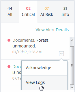
The Alerts panel on the right-hand side lists the most recent system alerts for your enterprise. The Alerts panel lists up to 50 latest unacknowledged, open, and closed alerts. Every 30 seconds, the list is refreshed with latest 50 alerts.
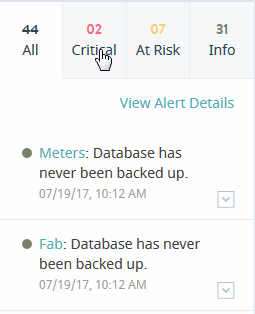
The Alerts panel contains tabs for Critical, At Risk, and Info alert types, as well as the All tab that shows all the above alert types. There are no tabs for other alert types, such as Offline and Maintenance. You can navigate the tabs to list events by their level of severity.
| Tab | Description |
|---|---|
| All | Display all alerts. |
| Critical | Display only Critical alerts. |
| At Risk | Display only At Risk alerts. |
| Info | Display only Info alerts. |
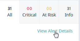
Click View Alert Details to navigate to the System Alerts page in the Support view. This page is described in System Alerts.
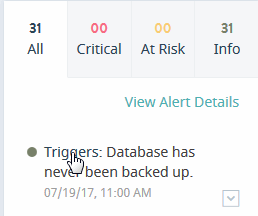
Click on the alert to navigate to the Metrics page for the resource in the Manage view. These pages are described in the following sections: Cluster Metrics, Host Metrics, Database Metrics, and App Server Metrics.
Next to each alert in the list is a menu where you can mark the alert as acknowledged, which suppresses the alert from further notifications, as described in System Alerts. Selecting View Logs displays the list of log files for the resource associated with the alert, as described in Event Logs.
Filtering by Resource
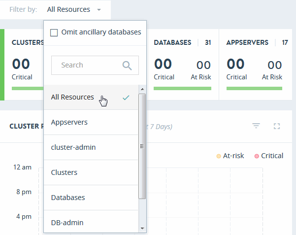
Use the Filter by menu to specify the Resource Groups to monitor relevant information in this view.
Either select All Resources, or choose from the available Resource Groups. Select Omit ancillary databases to omit system databases, such as App-Services, Extensions, Fab, Last-Login, Meters, Modules, Schemas, Security, and Triggers, from this view.
Overview Pages
The following sections describe each overview page in detail:
Clusters Overview
Click on the Clusters tab in the key performance indicators panel to open the heat map view for clusters.
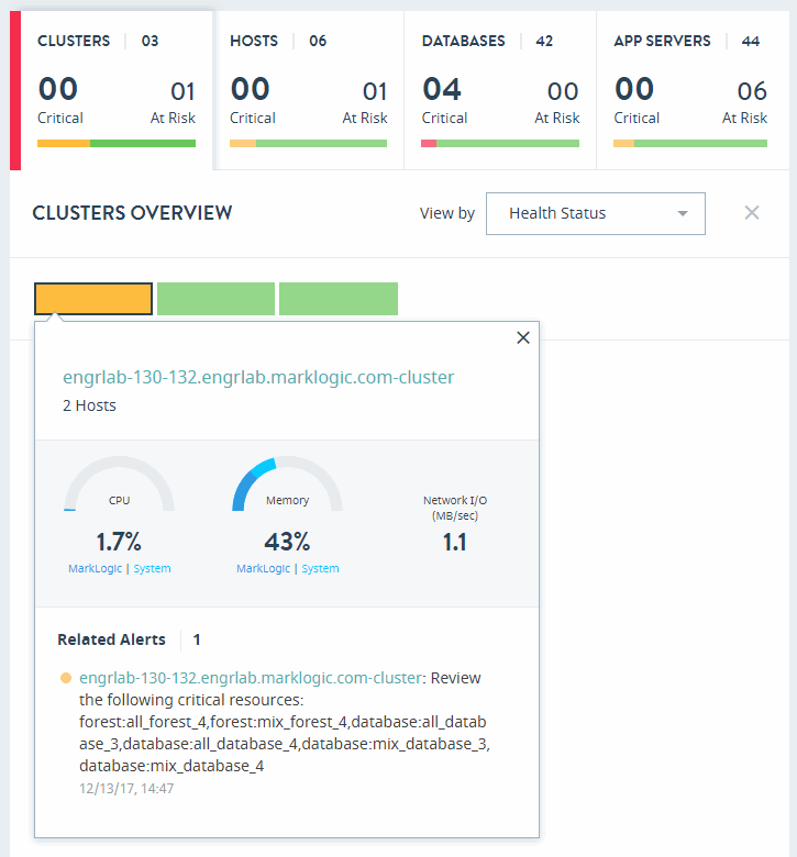
The CLUSTERS OVERVIEW page displays colored rectangles, each representing a cluster. You can quickly grasp the health status of large number of clusters and comprehend the overall impact at the enterprise or group level.
Clicking on a cluster displays the key performance metrics and any alerts for that cluster. The gauges represent resource consumption with percentage values.
In the CLUSTERS OVERVIEW page, you can sort the resources either by Health Status or Name.
To close the CLUSTERS OVERVIEW page and return to the top-level Monitor view, click the X to the right of the View by menu.
Hosts Overview
Click on the Hosts tab in the key performance indicators panel to open the heat map view for hosts.
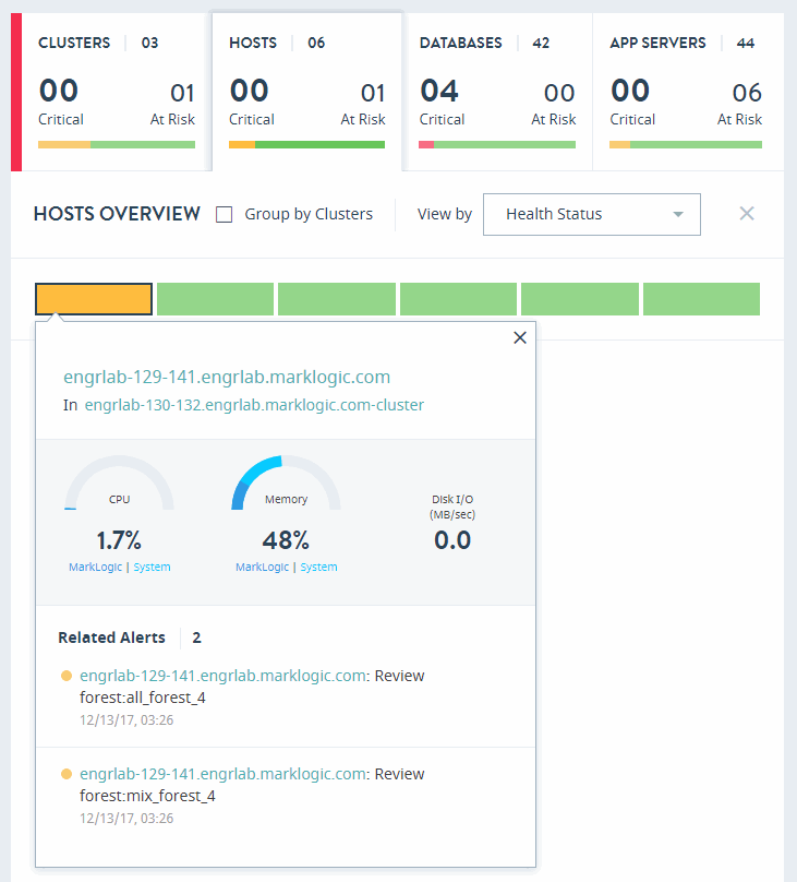
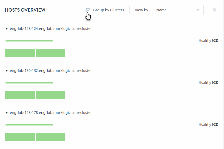
The HOSTS OVERVIEW page displays colored rectangles, each representing a host. You can quickly grasp the health status of large number of hosts and comprehend the overall impact at the enterprise/group level.
Click on a host to display the key performance metrics and any alerts for that host. The gauges represent resource consumption with percentage values.
In the HOSTS OVERVIEW page, you can sort the resources by either Health Status or Name.
Select Group by Clusters to sort your view of the hosts by their clusters.
To close the HOSTS OVERVIEW page and return to the top-level Monitor view, click the X to the right of the View by menu.
Databases Overview
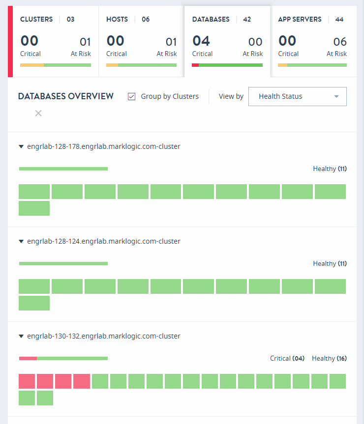
Click on the DATABASES tab in the key performance indicators panel to open the heat map view for databases.
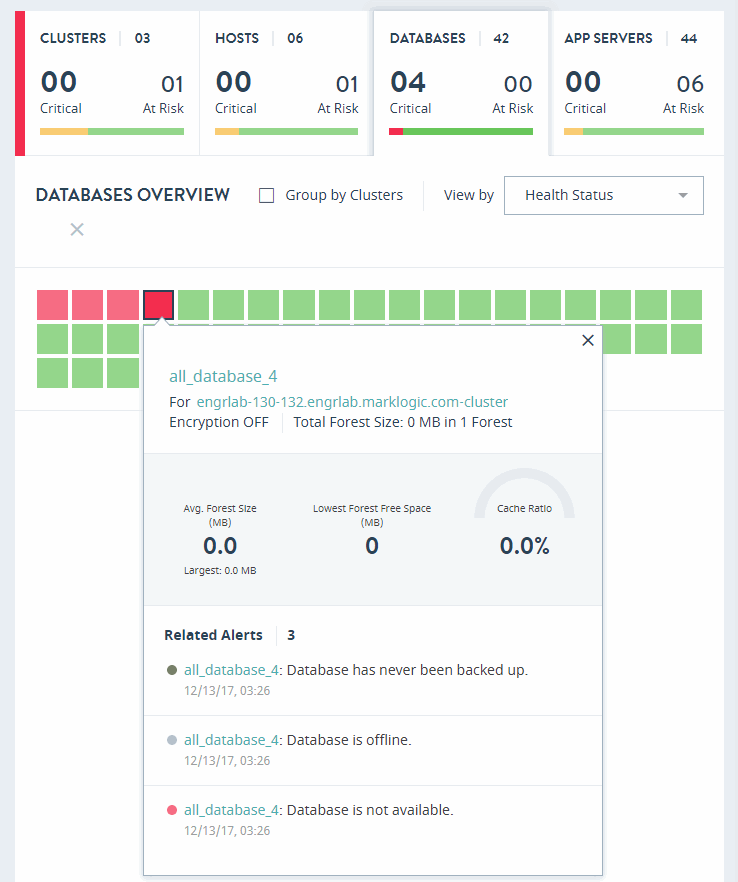
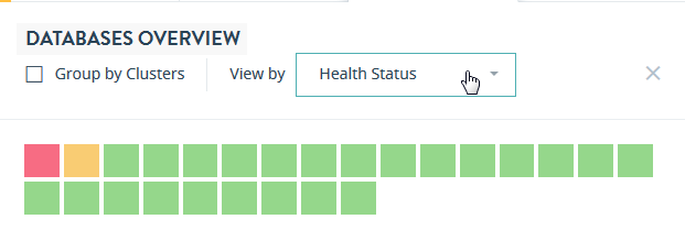
The DATABASES OVERVIEW page displays colored rectangles, each representing a database. You can quickly grasp the health status of large number of databases and comprehend the overall impact at the enterprise or group level.
Clicking on a database displays the key performance metrics and any alerts for that database. The gauges represent resource consumption with percentage values.
In the DATABASES OVERVIEW page, you can sort the resources either by Health Status or Name.
Select Group by Clusters to sort your view of the databases by their clusters.
To close the DATABASES OVERVIEW page and return to the top-level Monitor view, click the X to the right of the View by menu.
App Servers Overview
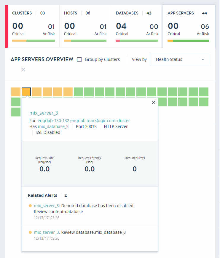
Click on the APP SERVERS tab in the key performance indicators panel to open the heat map view for application servers.
The APP SERVERS OVERVIEW page displays colored rectangles, each representing an application server. Administrators can quickly grasp the health status of large number of application servers and comprehend the overall impact at the enterprise or group level.
Clcik on an application server to display the key performance metrics and any alerts for that server. The gauges represent resource consumption with percentage values.
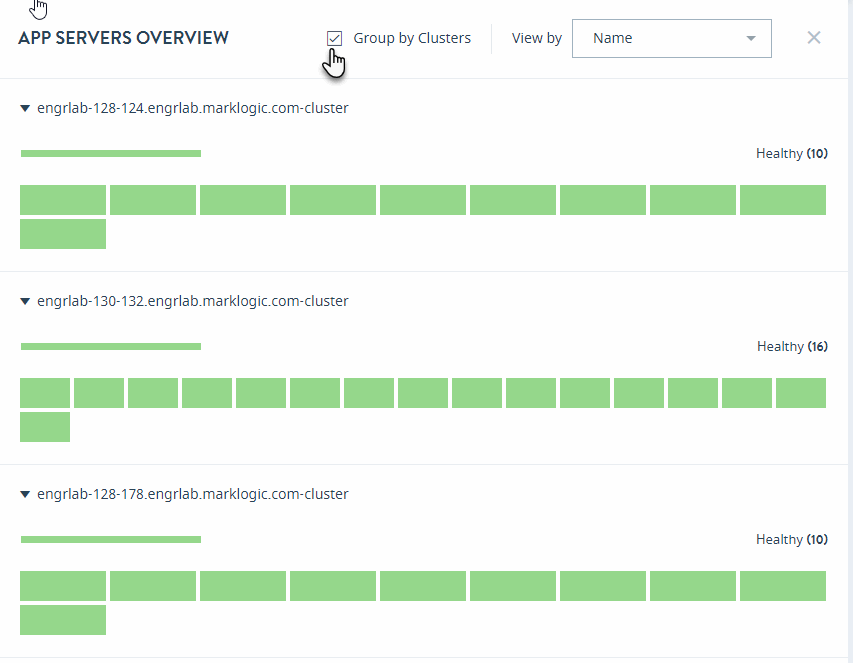
In the App Servers overview page, you can sort the resources either by Health Status or Name.
Select Group by Clusters to sort your view of the application servers by their clusters.
To close the APP SERVERS OVERVIEW page and return to the top-level Monitor view, click the X to the right of the View by menu.


