View monitoring history
You can display the Monitoring History dashboard by doing the following:
Open a browser and enter the URL:
http://monitor-host:8002/where monitor-host is a host in the cluster you want to monitor.
At the top of the page, click on Monitoring and click on History in the pull-down menu
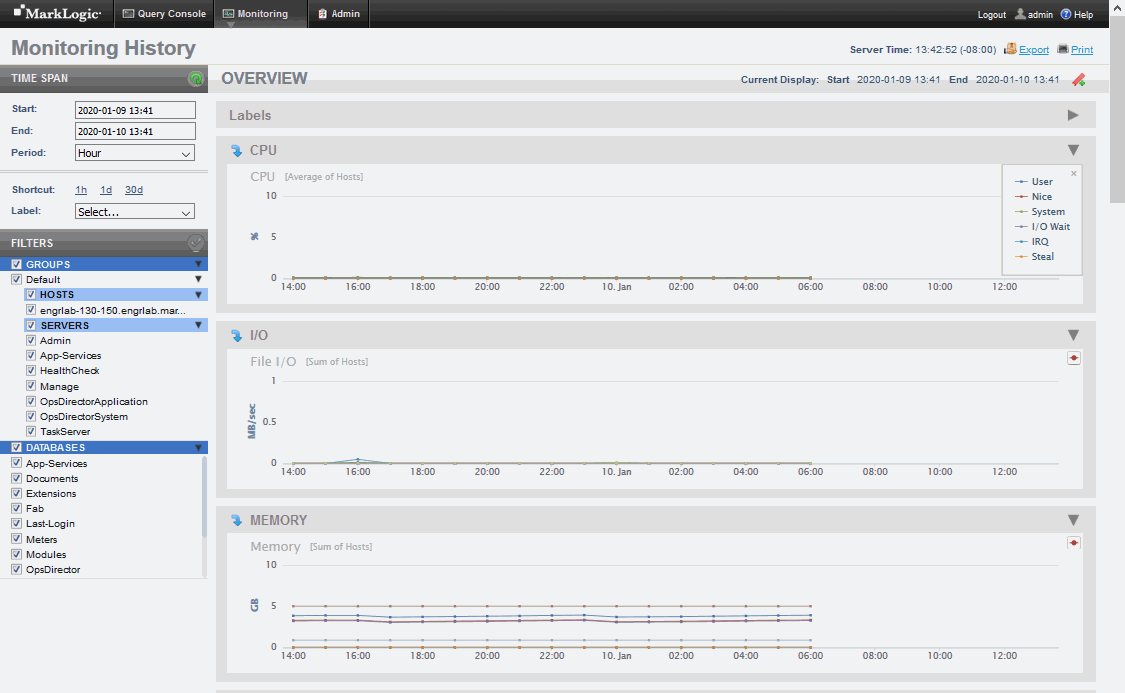
The Monitoring History page appears. From the Monitoring History Overview page, you can navigate to any of the pages described in this section.

Each line in a chart represents a metric for the resource. In the Overview page, the lines represent an aggregate of the metrics for all of the cluster resources. In each page below Labels, the lines represent the metric for each specific resource.
Chart titles on the Overview page include bracketed information specifying how chart data gathered across multiple resources is aggregated. For example, [Average of Hosts] means that the data retrieved from one or more hosts is averaged for display as points on the chart.
Each point on a line represents a period in which the performance data was captured. Hovering over a chart point displays the name of the resource metric, along with the performance value for the metric at that point in time.

The displayed metrics (in MegaBytes per second) are color coded. You can display a legend that indicates which colors represent which metrics by clicking on the red dot in the upper right-hand section of the graph. To close the legend, click on the ‘x’ in the upper right-hand portion of the legend window.
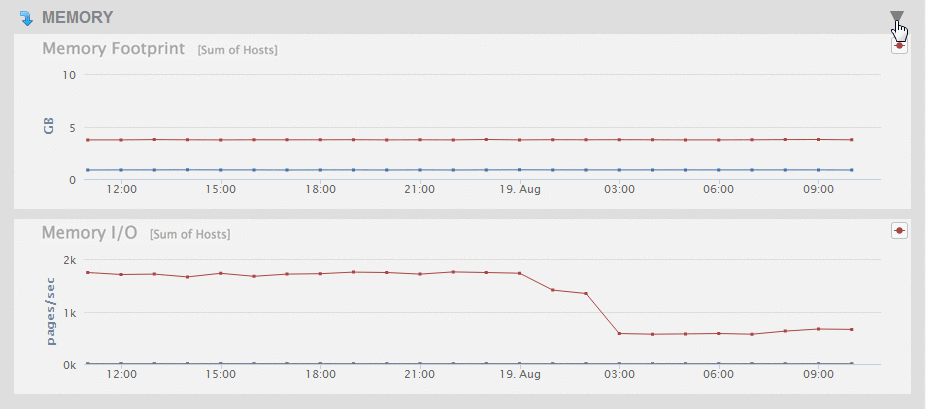
To simplify the view of charts on a page, you can collapse a chart or a group of charts for a resource by clicking on the triangle in the upper right-hard portion of the chart or chart group.

To expand a collapsed chart view, click on the triangle in the upper right-hard portion of the collapsed chart.
